ShowBuzz Process
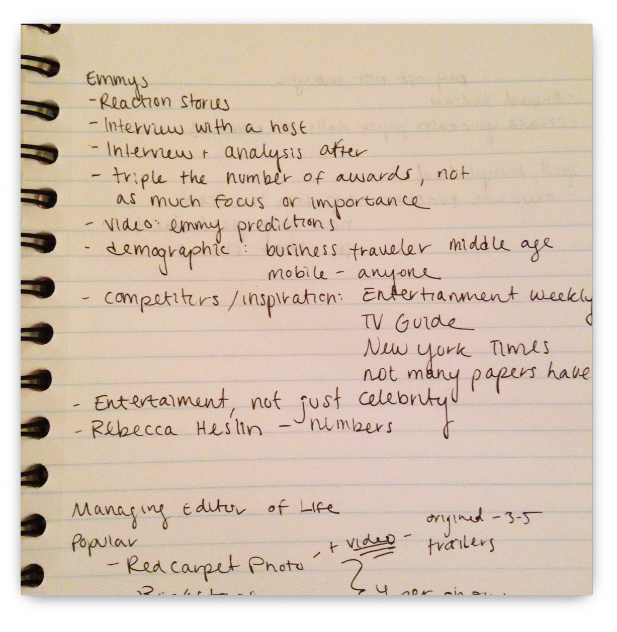
Research
To begin the process of recreating USA Today's "Best of Broadway" app, the interns and I analyzed why the existing app was less successful than its competitors. We also interviewed Life section editors of USA Today to understand how the audience connects with the content. Using the statistics and timelines they have gathered on USA Today web users, our creative brief proposed an app that includes the most engaging content and interactivity that brings year-round relevancy.
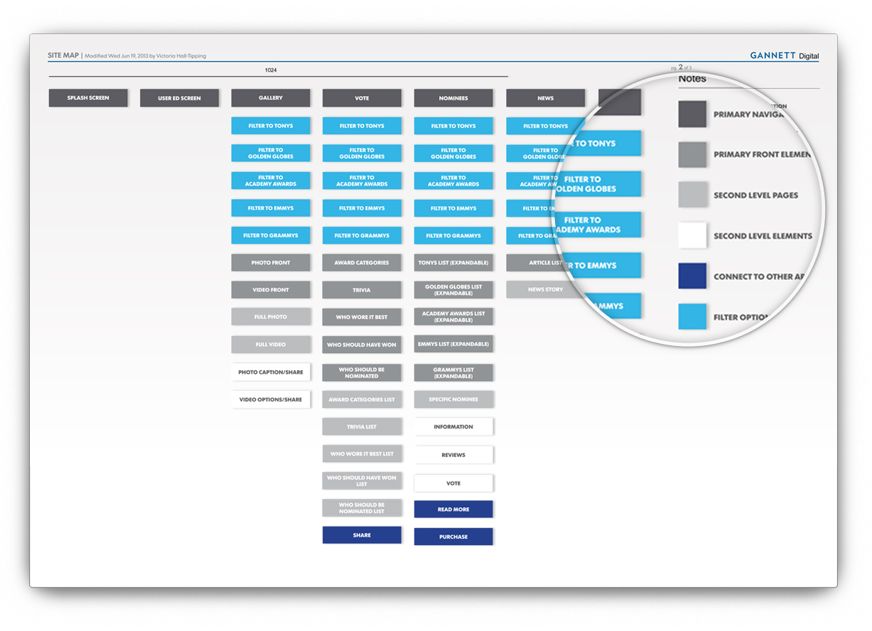
Sitemap
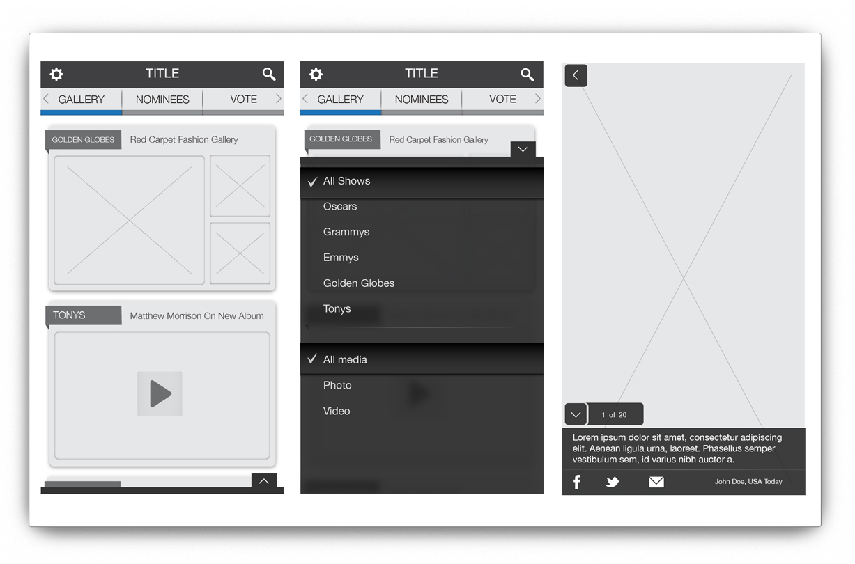
Once we had our design goals configured, we needed to decide how to organize all of the content we wanted to include. We categorized the sections by media type, such as photo/video, articles, interactive games, and information about the nominees and their work. Given the varying nature of awards show content - which is heavy at some points in the year and light at other points - we wanted to make sure the app was still current and changing every time it was opened. For that reason, each section is filterable to a certain awards show and interactive features keep the user entertained during the off season.
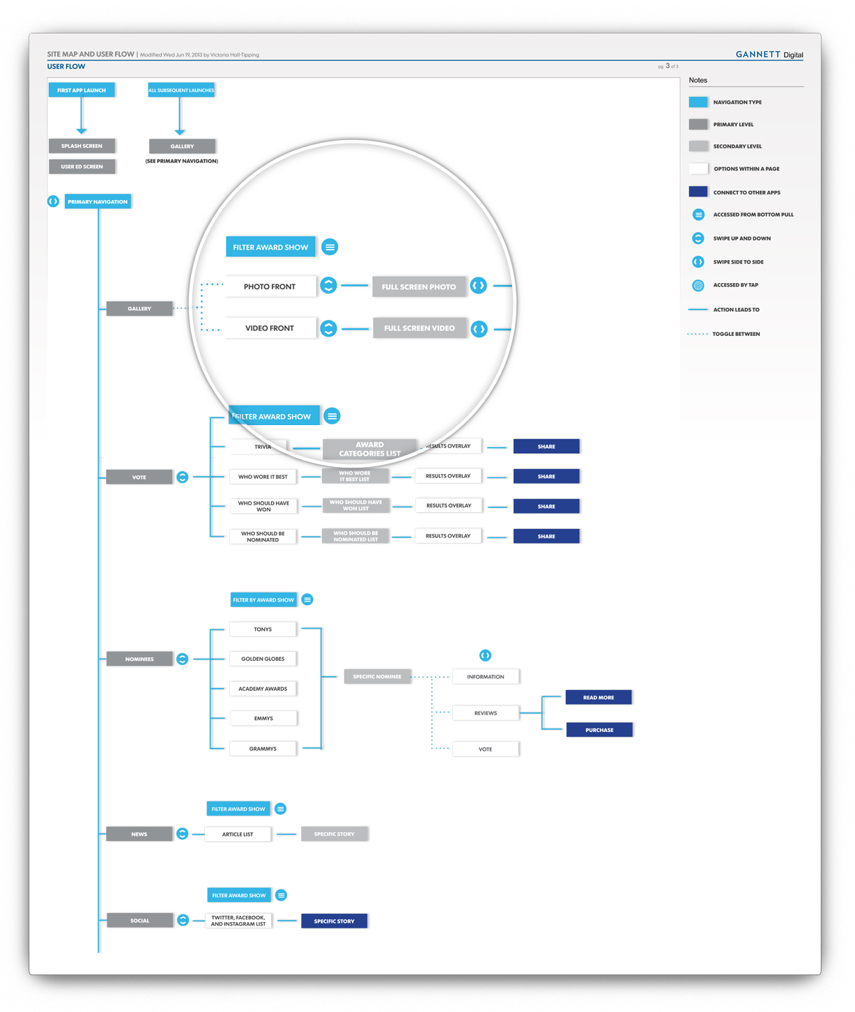
User Flow
We also created a user flow to outline the gesture patterns of the app. We made the sections swipeable from left to right so the user can quickly access different types of content. The content itself can be infinitely scrolled from top to bottom in each section.
Wireframing
Once the planning process was completed, we moved on to mocking up the screens as wireframes. This phase allowed us to see the holes and problem areas in our planning, which we were able to address before moving on.
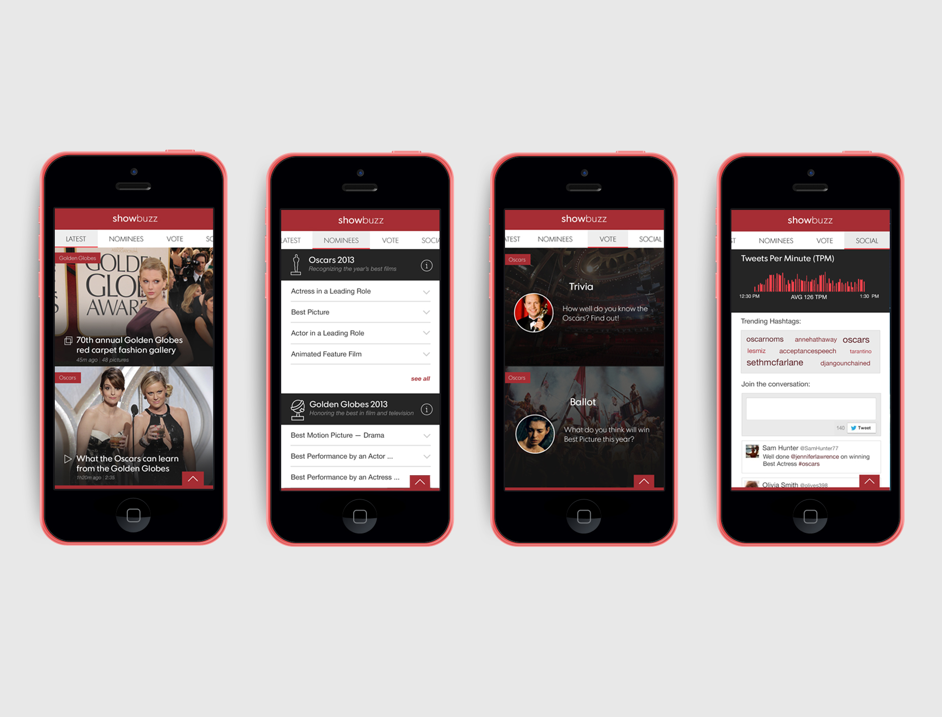
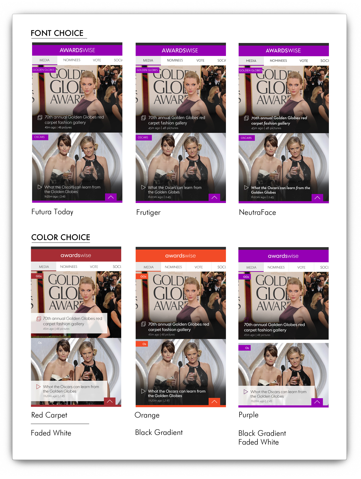
Visual Design
Our last step in the process was to decide on the look and feel of ShowBuzz. After much deliberation on the font choice, we went with Futura Today to tie the app back to USA Today, where the content will be aggregated from. We also agreed on the raspberry color to reference the red carpet.
Pitching
The interns on the project had a presentation day to outline the process of designing the app and the feasibility of implementing it into the USA Today platform. I created a prototype with all of our visual screens on Flinto, which allowed the attendees to download a prototype on their phones and navigate the app alongside with the presentation. The pitch was very successful, and the upper management of the Life section are considering development for the 2015 awards show season.